Guide to building a Financial Dashboard in FCCS.
Sarah Dow
Brovanture Consultant
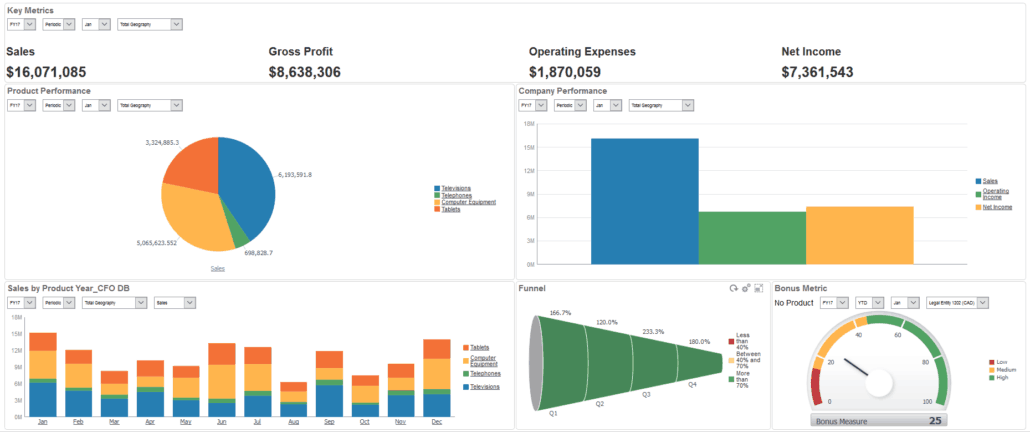
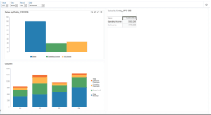
Oracle Financial Consolidation and Close Cloud Service (FCCS) financial dashboards enable the graphical representation of a company’s results. FCCS delivers one predefined dashboard in the form of FCCS_Income Statement Dashboard, see the example above.
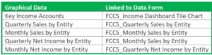
Each graph is linked to a data form which provides the displayed data and the dimension hierarchies that facilitate drill down capabilities to explore the data in more detail. Below is the list of the forms used in this predefined dashboard:
If you read my last blog on creating Infolets then the same advice applies, before creating your dashboard, design the layout in Microsoft Excel and scope the data required from the data forms to populate the dashboards. Points of View, (POVs) should be considered if you wish to use a global POV for all graphs i.e. Entity, Period, Year etc.
Let’s get started!
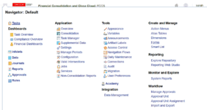
1. Create the data forms scoped out in your design phase. From the Navigator select Create and Manage and then Forms
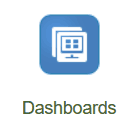
2. Once your data forms are complete, you can create a new dashboard by selecting the Dashboards Cluster and then the Financial Dashboards card.
 and then
3. Next select the Create ![]() Icon.
Icon.
4. This will open the dashboards designer palette, as shown in the screenshot below:
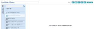
5. Select the desired data form from the left-hand pane and drag it into the designer palette. This will then display the data in a tabular form.
6. To show the data in a graphical representation, select the Chart Types tab on the left.
7. This will display the various Chart Types available from Area to Pie.
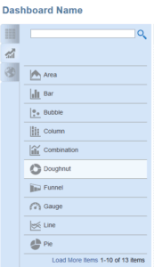
8. Select your chart type and drag it onto the page, positioning the chart to sit above, below, left or right of the existing page entry, placing the chart in the relevant boarder area. You will notice it highlights the chosen border in blue, as below:
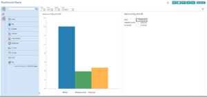
9. Once you have dragged your choice of chart onto the page you will see the sample chart as below:
10. To link the chart to the data form, hover over the chart with your mouse and you will see the settings cog. 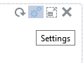 The settings have 4 tabs – Charts, Data, Axis and Colours.
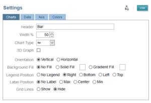
11. The Charts tab allows you to give the chart a header, choose its page width, change the chart type etc.
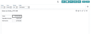
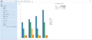
12. The Data tab has 3 options for source data; Sample, Forms and Cell Details, the chart will default to Sample. To select a data form select the Forms radial button and browse for the relevant form (note you have a search option). I’m selecting Sales by Entity_CFO DB.
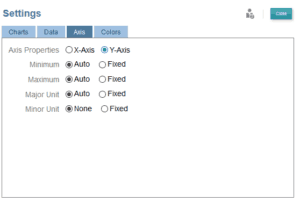
13. The Axis tab allows you to change the axis from Auto to Fixed if desired.
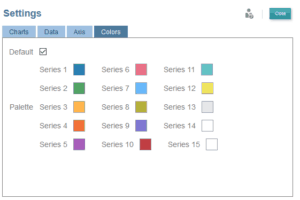
14. The Colours tab allows you to change the series colour palette if desired.
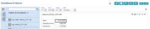
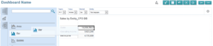
15. Your Dashboard will look like the one below. Before we add another chart save the Dashboard by overtyping Dashboard Name with the required name, and then click Save.
16. Next, from the Chart options, drag the Column chart type to the bottom left boarder so the column chart sits below, pick a data form from the setting cog. I’m selecting Product Analysis_DB:
17. Next from the Chart options drag the doughnut pie chart type to the bottom right boarder so the Pie chart sits below the Sale by Entity table. Pick a data form from the setting cog. I’m selecting Sales by Product.
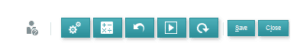
18. There are additional options from the main menu at the top right-hand side of your dashboard view:
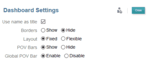
19. The Settings cog allows you to show or hide boarders, change the layout from a fixed format to a flexible one, show or hide the POV bar and also allows the ability to have a Global POV bar. Having a Global POV bar will allow you to change the Entity, for example, and all charts on the dashboard will reflect that entity change.
20. The Rules icon allows you to add business rules to perform before or after you load the dashboard – such as a consolidation or translation.
21. You also have the ability to reset the dashboard to start again, and a runtime, to preview how the finished dashboard will look, followed by refresh, save and close.
Until next time…
Sarah


 +44 (0)1483 685450
 contact us